Ah, the one issue all tech writers must contend with: you worked hard, hunted down developers to find out about all the important features you need to document, tied subject matter experts to a chair until they gave you answers to your questions, lovingly crafted clear and concise user documentation, loomed over the product manager until they finally read over your work and gave it the all clear, and now your beautiful user help is available in the product.
And no one is using it !
Why ?
According to this study, fully three quarters of people just do not read user manuals.
There are two main reasons for this:
1 – Simply put, users are people, and people are lazy.
This is not, in and of itself, a bad thing.
People are using software to accomplish a specific task. This task takes time and effort, and the modern world requires so much constant attention that putting more mental effort into one task than strictly necessary is frankly too much to ask.
2 – Paradoxically, users are also active.
They prefer learning by doing as opposed to reading a dense wiki full of unknown verbiage.
As anyone whose father ever insisted that he knew perfectly well how to program the VCR knows, users tend to assume they can figure things out by themselves.
Novice users tend to skip instructions and prefer learning by trial and error. Advanced users usually assume that they already know all they need.
People think all they need is common sense. Sadly, this only works if your application was designed with common sense, which it wasn’t. How could it be, when nobody can agree on what common sense even is?
If your application is simple and well-designed, your users may be able to get by on their own. If your application is more like a VCR, then your users are going to need a little help whether they like it or not.
What do users even need, really ?
People often avoid user help like the plague because the very phrase conjures visions of thick manuals, impenetrable wikis, dense concepts and wildly overcomplicated diagrams.

And for a long time, most user help was, if not specifically like that, still completely overkill for most users whose problems are usually straightforward.
A lot of help is in fact still overkill, but it doesn’t have to be.
Once more, users are using your app for a specific task. They need the information necessary to accomplish that task and no more.
They don’t have the time or energy to read through a giant wall of text to find the one nugget of information they need. They are, however, willing to engage with documentation if it is easy, convenient and requires little effort.
So how do we give them easier, more convenient user help?
Contextualized embedded user help: big words, simple ideas
Embedded user help is user help that is available directly in your app, as opposed to in a separate window or in a portal.
Contextualized content is designed based on user scenarios. It is short and to the point, and only presents information that is relevant to the context. In software, most of the time the context is the window, tab or panel currently in use.
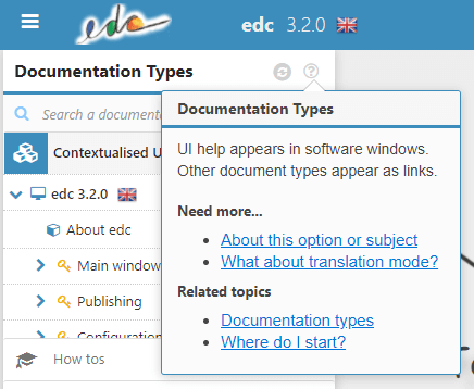
Here’s an example of embedded contextualized help:

This example is taken from a user help creation tool my company created, edc.
We have developed it precisely to respond to these issues.
As you can see, the help is opened from an unobtrustive yet recognizable help icon placed directly in the UI. These icons are dotted all over the interface, wherever the tech writer (in this instance, me) deemed them useful.
Clicking on the icon brings up small nuggets of user help that answer the most common user questions or issues for the tasks done in this specific part of the interface.
In this case, the most common questions are “Why are there several documentation types? Which one do I need?” (from experience, most basic users questions are some variation of “What does this do?” and “How do I do this?”).
The links lead to longer help, for more complex usage issues.
The pop-up brings the information necessary for using the Documentation Types panel and no more.
The user doesn’t need to parse or filter the information, since it comes pre-filtered for their convenience.
The self-service nature of embedded help means that they can just grab small pieces of help as they’re working without slowing down.
Reading the help becomes part of the workflow !
What do you think?
Would your software benefit from embedded help?
Do you already use context when crafting content?


